Mikhak Talaee
Flower Shop Web Redesign
Mikhak Talaee is an Iranian online flower shop offering a variety of flowers and indoor plants, along with gift options for different occasions and creating meaningful moments.
Our team took on the task of redesigning the website's information architecture and refining the flower purchasing process.


Project Overview
Business Goal

Improve customer retention and increase sales by enhancing user experience, simplifying navigation, and streamlining the ordering process.
Target Users
People from different cities can order flowers online and have them delivered to their loved ones in Tehran for special occasions like birthdays, anniversaries, weddings, or other meaningful moments.

The Process

Our design process consisted of four phases; by taking an iterative approach, we were able to move freely between stages as the project evolved.

Discover
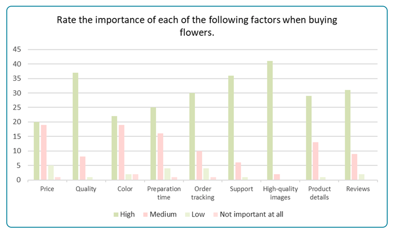
we conducted a survey with 47 participants to gather quantitative insights into their priorities when purchasing flowers, preferences for different flower arrangements, and how they categorize various occasions.
Survey
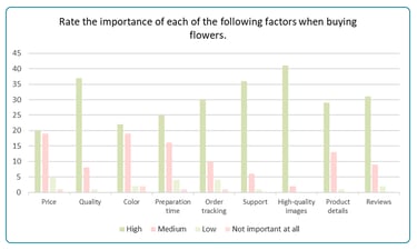
High-quality images, flower quality, and customer support were top priorities.
1. Factors Influencing Flower Purchases
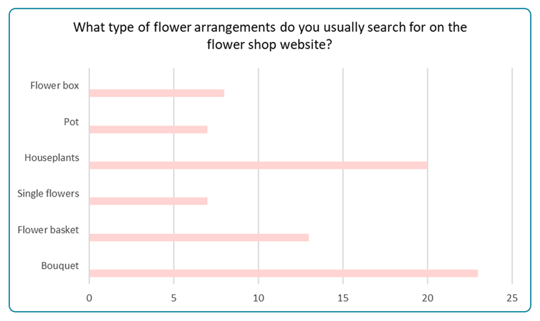
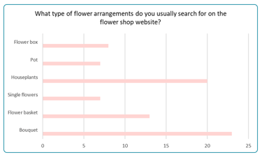
2. Top Searched Flower Arrangements
Bouquets were the most searched type, followed by houseplants and flower baskets. This influenced how we prioritized these options in the navigation menu and search filters.
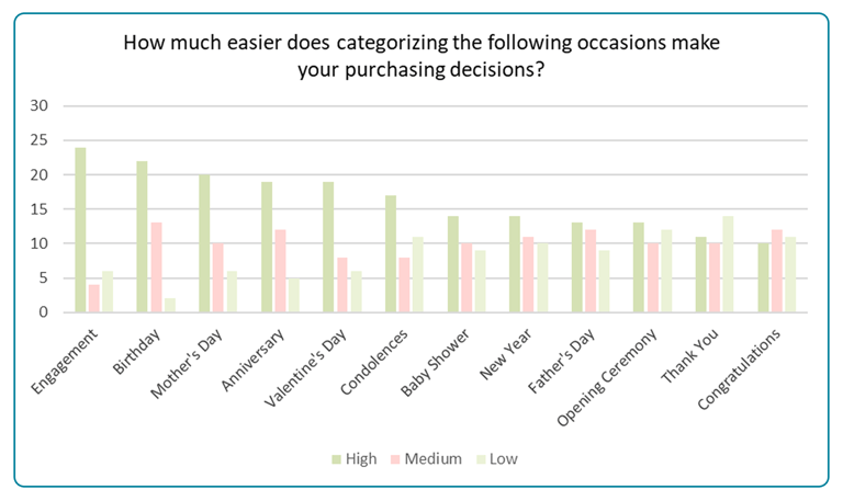
3. Relevance of Occasion-Based Filters
Celebrations such as engagements and birthdays are rated as the most helpful filters. We have implemented these as primary categories in the navigation.
Competitive Analysis
Then, we analyzed various websites to identify the key filters and determine their prioritization. These filters make the flower selection and purchasing process easier and faster for the user
The key filters observed, ranked by prevalence, include:
Same-Day Delivery
Price
Flower Type
Color
Design Type
Occasions
Interview, Contextual Inquiry


In the next step, We conducted interviews and contextual inquiry with 25 users to explore their flower-shopping habits, challenges, and preferences.


Define
Affinity Diagram


Based on the insights gathered from our research, we created an affinity diagram to organize the information into appropriate categories for improving the website design.
User Journey Map


To identify key issues with the current design, we conducted a usability test on the flower purchasing task. This helped us understand where users struggled and why. Next, we created a user journey map to highlight the pain points and challenges users face during the process.
Persona


Now, we have created our persona based on the comprehensive research process and the data we gathered. This persona represents our target users, and the website will be redesigned based on Ehsan's needs, preferences, and goals.
Develop
Card Sorting


To organize the information architecture, we conducted an open card sorting with 7 participants and a hybrid card sorting with 9 participants. These methods helped us understand how users naturally categorize information, allowing us to refine the website structure based on their mental models and needs.
Site Map

We used card sorting to organize the website logically, starting with an initial sitemap. Then, we improved it based on usability testing and user feedback to match user expectations and make navigation easier.
User Flow

Based on the user needs and feature requirements outlined in the project, we created a user flow diagram to define and visualize the screens and interactions users would experience while using the website.
Design
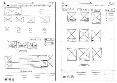
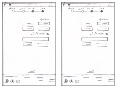
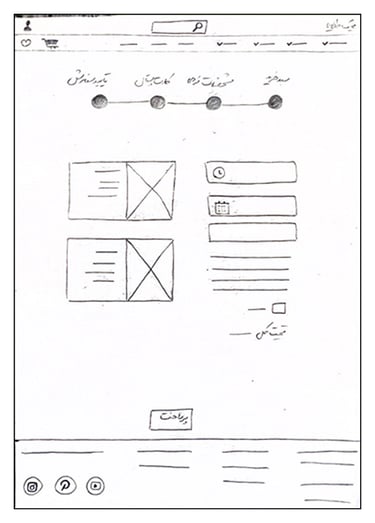
Sketches
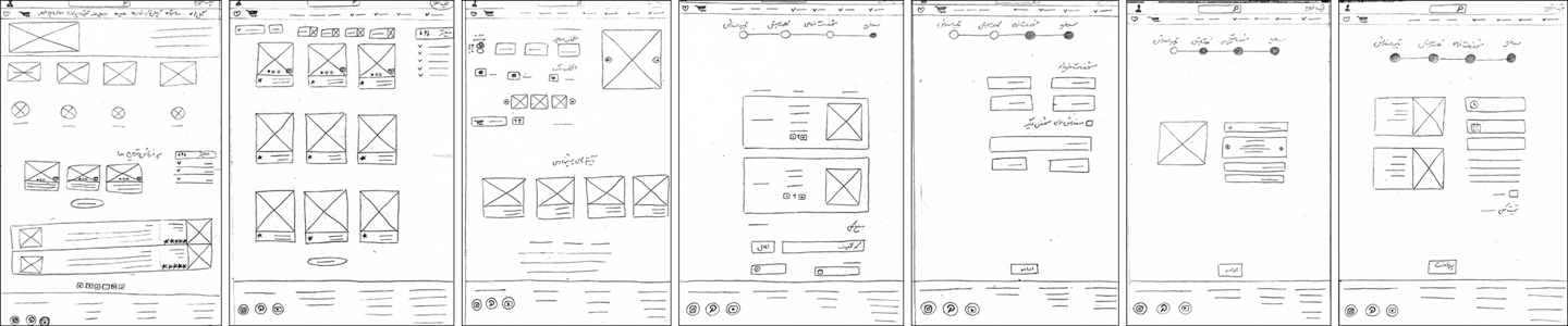
We started our design process by creating hand-drawn sketches to brainstorm and quickly visualize ideas. These sketches provided a foundation for discussion and alignment within the team.
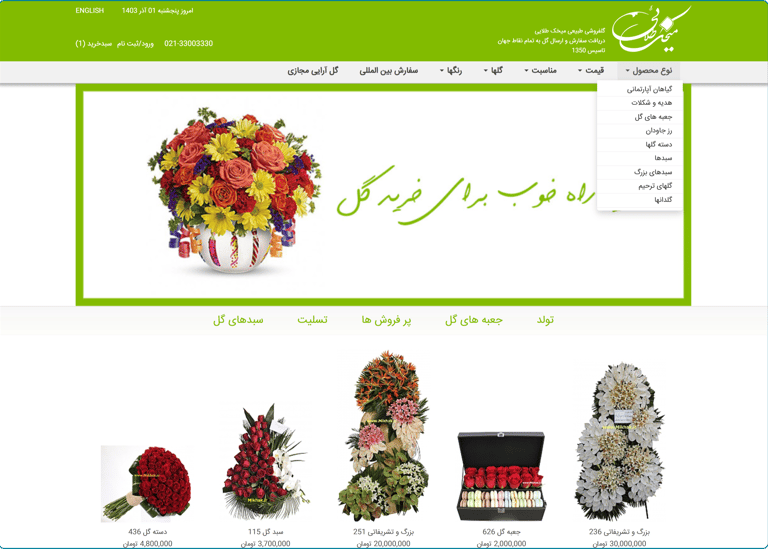
Home Page
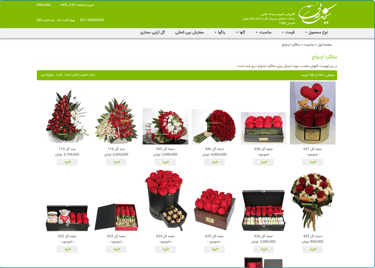
Category Page
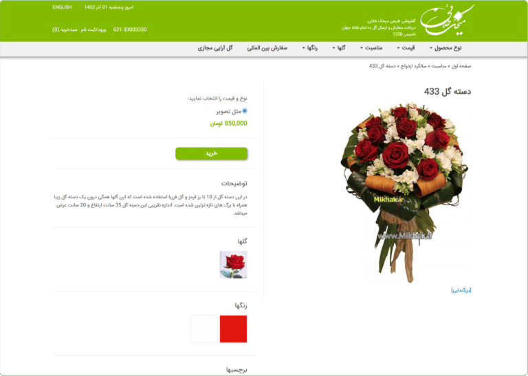
Product Page
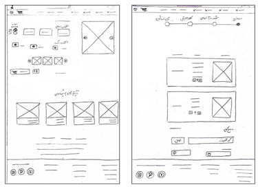
Basket Card
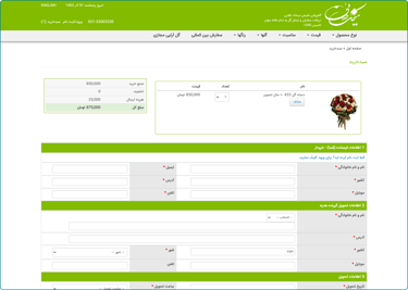
Receiver Info
Cart Postal
Check Info
Mid-Fi Wireframes
Once finalized, we transitioned the designs into mid-fidelity wireframes in Figma, focusing on key elements like navigation and layout structure. We also conducted a heuristic evaluation to identify usability issues early in the process. Based on iterative feedback and evaluation results, we refined the wireframes to better meet user needs and align with project goals.


Usability Test & Iteration
We enhanced our design by incorporating insights gained from usability testing, ensuring a more user-friendly and efficient experience.


What did I learn?
What's next?
Write a short text about service User Insights: Research and feedback helped identify user needs and shaped the design process.
Iterative Improvement: Repeated iterations on mid-fidelity wireframes enhanced usability and logical flow.
Team Collaboration: Effective teamwork ensured deadlines were met.
Upgrade to high-fidelity designs with detailed visuals and interactions.
Conduct usability tests to refine user flows further.
Optimize content for a better shopping experience.
Explore future mobile adaptation possibilities.