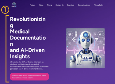
DR. PAL Redesign
A Responsive Healthcare Platform
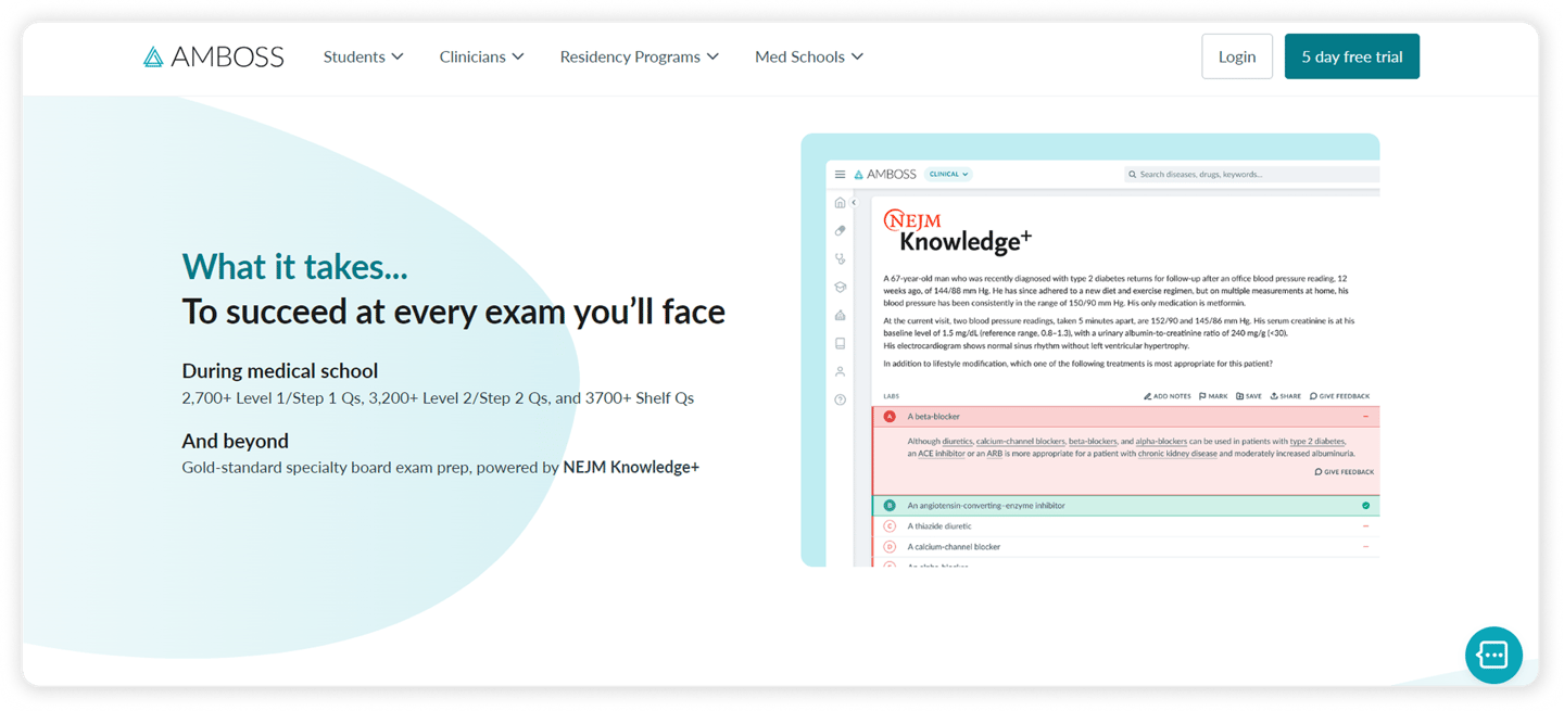
What Is Dr. Pal?
This project involved redesigning the responsive website to better guide users through these tools with a clear, simplified experience.
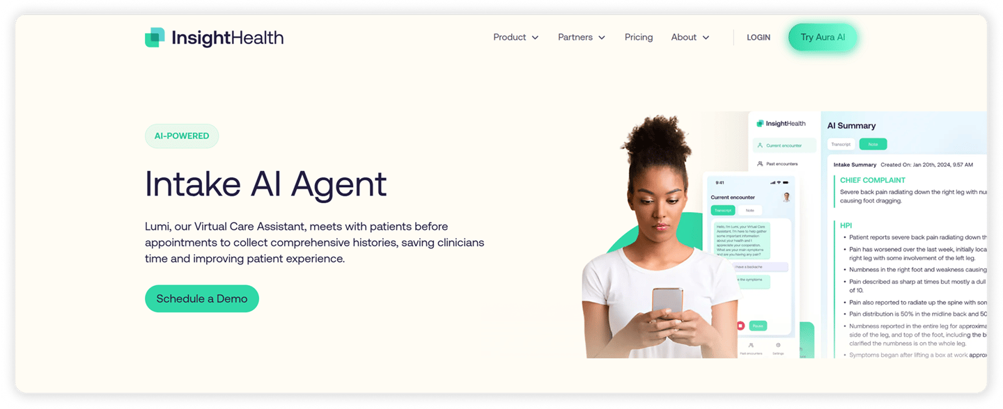
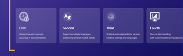
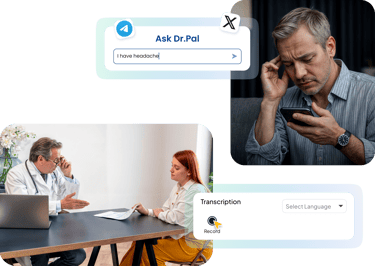
Dr. Pal is an AI-powered healthcare platform that provides intelligent tools to streamline care for both doctors and patients, along with a token-based system for easy access to health-related products and services.
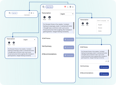
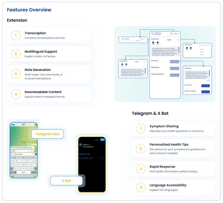
Extension for automatic SOAP note generation to streamline doctors’ documentation.
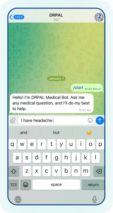
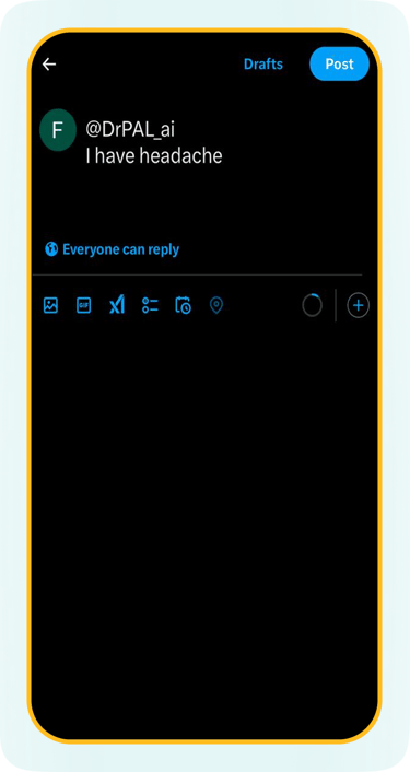
Multilingual chatbot on Telegram and X for patient symptom checks and health guidance.


Project Overview

Problem Statement
The previous Dr. Pal website did not clearly explain what tools the platform offered or how they could be used by doctors and patients.
Business Goal
Make the experience simple and smooth for both doctors and patients
Users were confused about the purpose of the site and how to interact with features like the browser extension or the Telegram/X bots.
Poor information architecture and vague product descriptions led to a confusing experience for users.
The visual design lacked trust-building elements, and the UX writing was not clear.
Improve overall usability and accessibility across mobile and desktop devices.
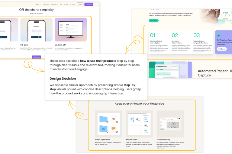
Use step-by-step visuals and clear wording to help users get started quickly
Explain complex features like blockchain and AI in a way that’s easy to understand

The Process
To redesign the Dr. Pal website, we followed a user-centered approach that helped us understand user needs, define problems, and build effective solutions step by step.
From early research to usability testing, here’s a breakdown of the process we went through:
In the first step of the design process, we conducted a heuristic evaluation on the existing website to identify usability and interface issues. This helped us surface key pain points that affected the overall user experience:

Heuristic Evaluation
Poor information architecture
Lack of Transparency on Platform Products
Weak UX writing
The visual design doesn’t align with the product concept
Challenges
Our Response
The business goals and product scope changed multiple times
The initial design lacked clarity in communicating the product’s value
A second target user group (patients) was introduced during the project
New features, such as Telegram and X bots, were introduced mid-project
The payment method shifted to blockchain technology
Through iterative design and close collaboration with stakeholders, we continuously adapted the UX to meet evolving goals—while keeping the experience simple and clear for users.
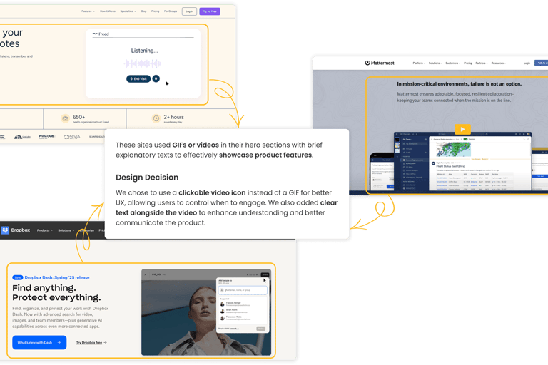
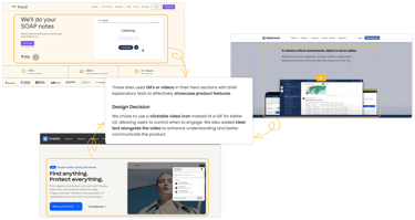
Competitive Analysis
We performed two types of competitor analysis to guide our design decisions for Dr. Pal:
The goal of these analyses was to improve the user experience, increase transparency in how services are presented for Dr. Pal users.
Functional Competitor Analysis: Reviewing digital health platforms with similar features and services.
UX/UI Benchmarking: Studying products known for their high design standards and clear service and pricing structures.
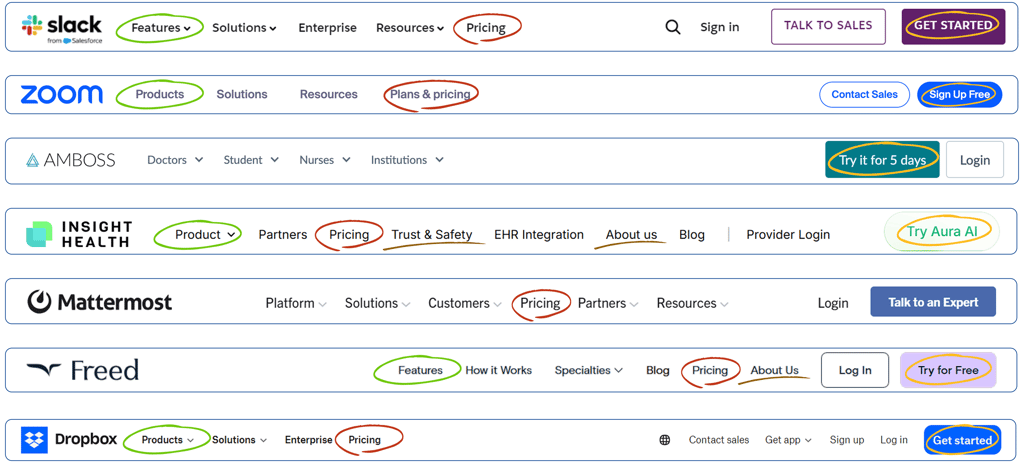
Navigation
After a thorough competitive analysis of navigation bars, we held brainstorming sessions to build on the strengths we observed and avoid common weaknesses. As a result, we carefully refined each navigation link as follows:
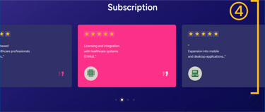
While most websites use "Pricing" or "Plans and Pricing" for their purchasing sections, we changed it to "Dr. Pal Token" due to Dr. Pal's exclusive use of tokens, making the payment method clear to users.
The "Product" navigation link was initially suitable, as shown by our competitive analysis, but was later changed to "Features" to avoid confusion with partner product banners and better highlight our core services for new users.
The initial design lacked "Sign Up" and "Log In" buttons. Based on our competitive analysis and the business’s 5-day free trial offer, we added a "Try It for 5 Days" button to clearly showcase the advantage and boost user engagement.
Pages like "Privacy & Policy," "About Us," and "Contact Us" do not need to appear individually in the main navigation. Instead, we grouped them under a dropdown menu titled "Company."

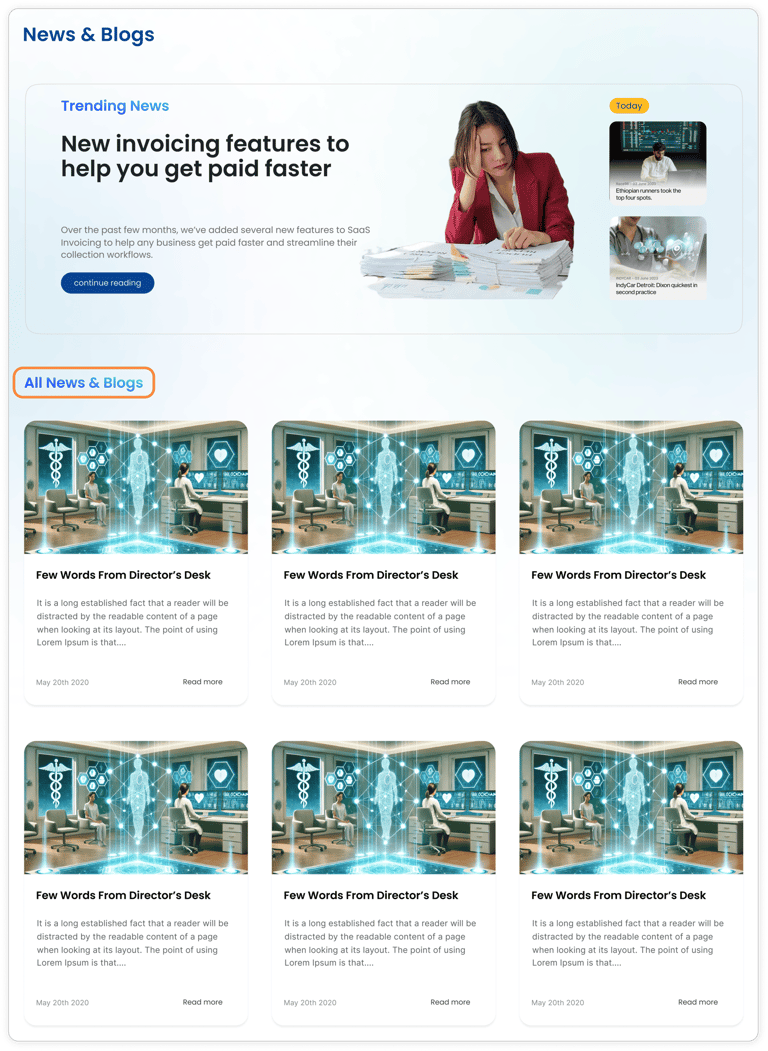
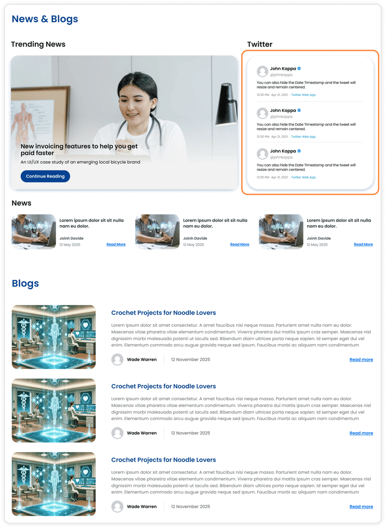
Initial Version
Final Version
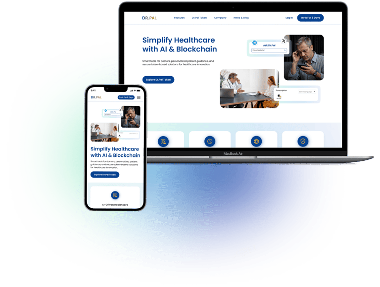
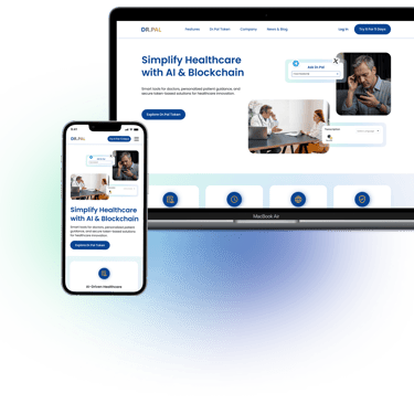
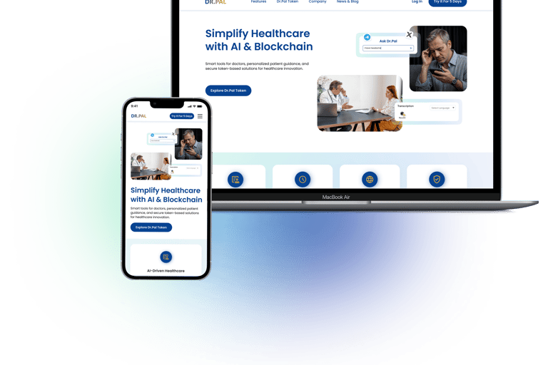
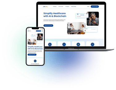
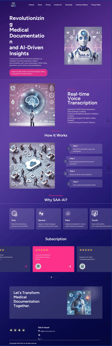
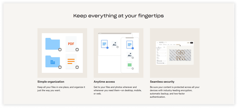
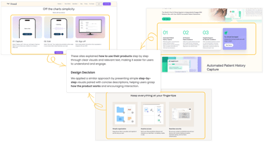
Features Overview

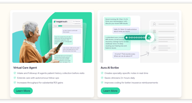
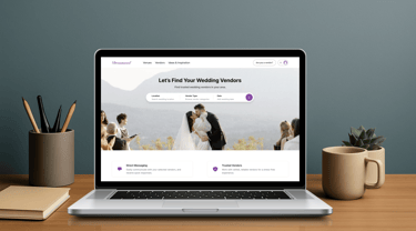
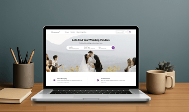
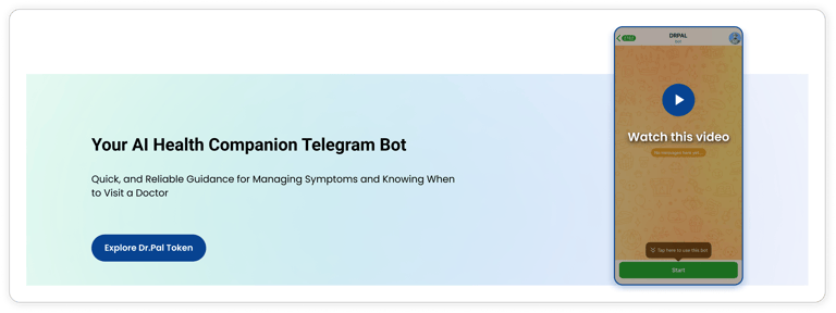
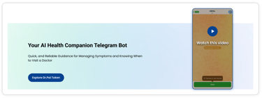
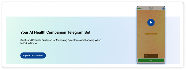
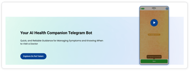
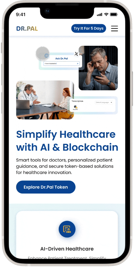
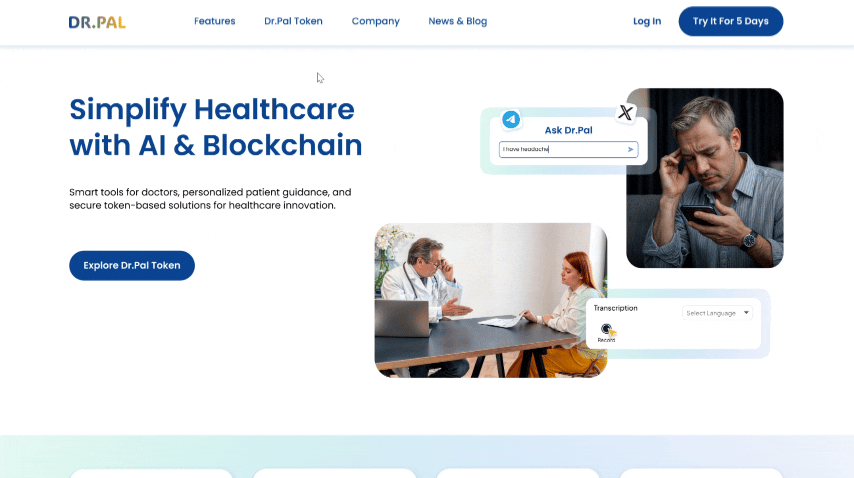
Hero Section of Product Page


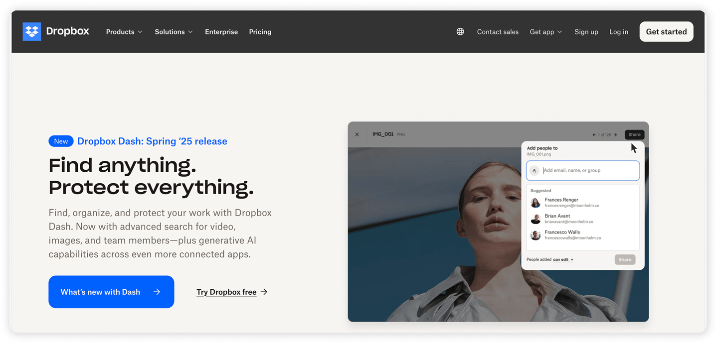

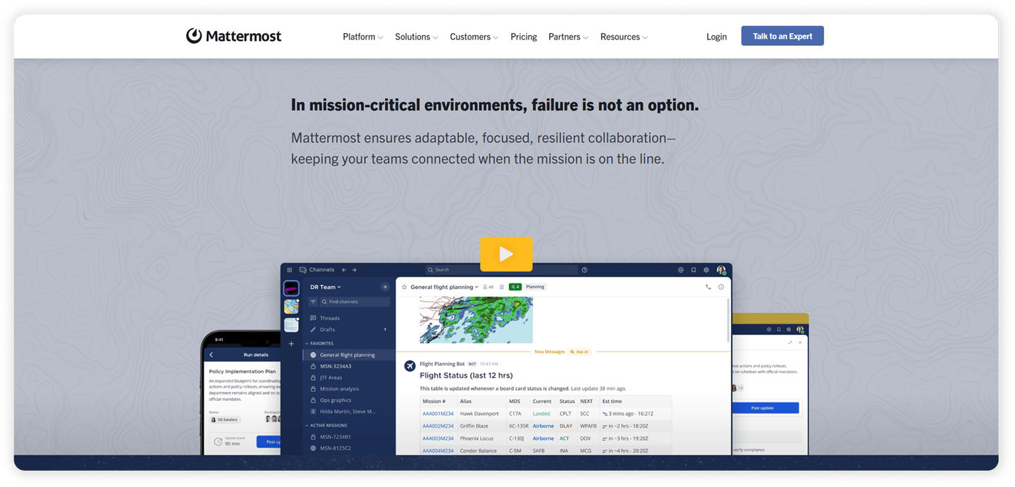

Hero Section of Home Page


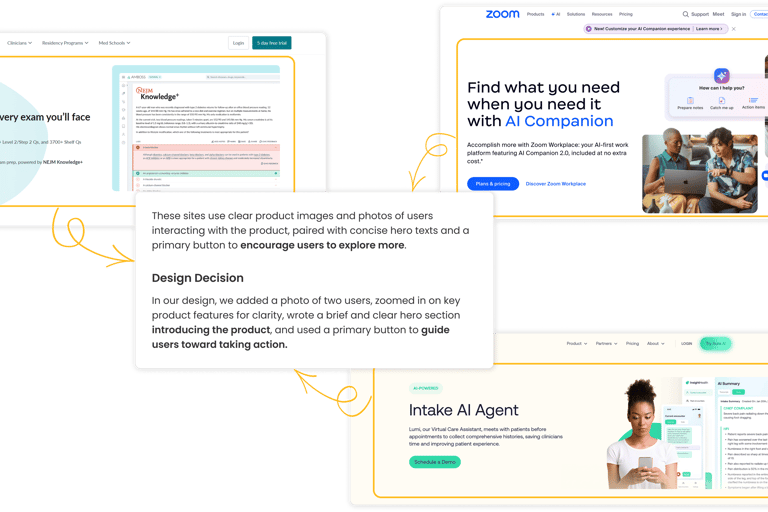
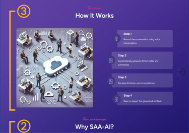
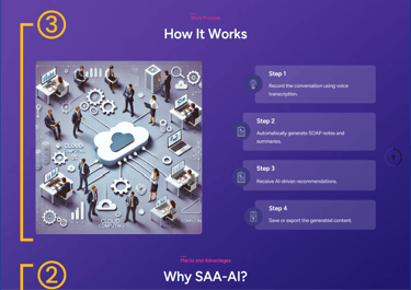
How it work Section


Personas
Based on research insights and team discussions, we developed two personas—one for doctors using Dr. Pal’s extension, and one for patients looking for fast and accessible health support. These personas guided our design decisions by keeping real user needs at the heart of the process.


How Might We...
To enhance the user interface and overall user experience, we reframed user needs into 'How Might We' (HMW) statements. Through brainstorming around these statements, we explored various solutions and ultimately selected the most suitable one for the final design.


User Storyboarding
We used storyboards to visualize our personas’ needs and challenges, which helped us identify key goals and ensure our design decisions aligned with real user contexts.
1. Emily Carter – A doctor looking to streamline documentation.
2.David García – A patient needing fast, multilingual health support.
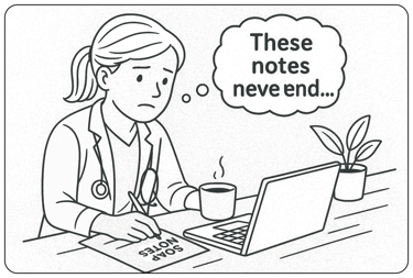
Scene 1: The Daily Struggle
Emily, mentally drained after her last patient visit, reviews her notes. Writing SOAP notes took too long—she thinks, “There has to be a simpler way.
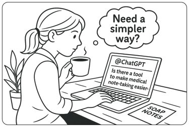
Scene 2: Searching for Help
She opens ChatGPT and types: "Is there a tool to make medical note-taking easier—something that supports multiple languages?"
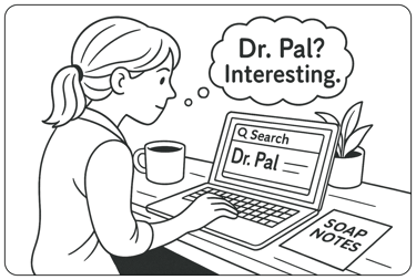
Scene 3: Finding Dr. Pal
Among the suggestions, one stands out: Dr. Pal A Chrome extension designed for healthcare professionals. Emily clicks the link to learn more.
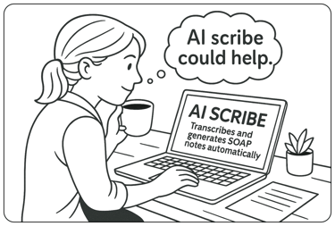
Scene 4: Discovering the Solution
She reads: “Dr. Pal is an AI-powered Chrome extension that transcribes visits and generates SOAP notes automatically.” It sounds perfect for her.
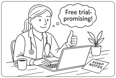
Scene 5: Seeing the Possibilities
Positive reviews catch her eye. A 5-day free trial gives her confidence. It feels simple, secure, and made for busy doctors like her.
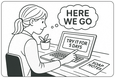
Scene 6: Taking the First Step
Emily decides to give it a try. If it works, it could finally make documentation easier and faster.

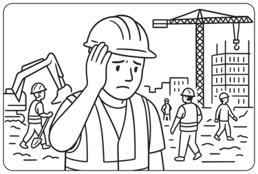
Scene 1: Minor Symptoms Strike at Work
At a construction site in Barcelona, David suddenly feels dizzy and fatigued. He pauses, unsure if it’s serious or just stress.

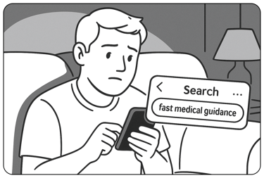
Scene 2: Searching for Quick Medical Help
At home, David grabs his phone and searches for fast, trustworthy medical guidance—no appointment needed.
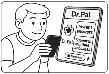
Scene 4: Discovering Dr. Pal
Browsing search results, David finds the Dr. Pal website and its AI-powered Telegram bot. Fast responses and multilingual support catch his attention.

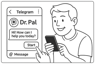
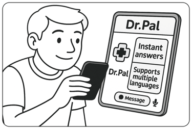
Scene 4: Taking the First Step
David decides to start using the Dr. Pal Telegram bot.
It feels like a simple, reliable way to get help—without the wait or confusion.

Site Map
Using research findings, we restructured the website’s architecture and refined the sitemap based on usability testing.


User Flow
We refined the user flow to visualize key screens and interactions, ensuring smooth and intuitive navigation based on user needs and feedback.


Mid-Fidelity Wireframes
The table below summarizes key sections of the website across three stages—highlighting how the design improved from the Initial Version to the Chrome Extension launch, and later to the Multi-product Platform model:


Home Page (Initial)
Home Page (Version 1)
Home Page (Version 2)
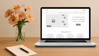
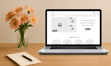
Product Page
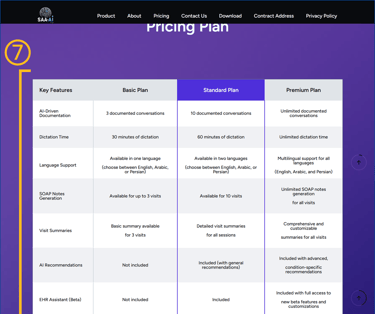
Pricing Page (Initial)
Pricing Page (Version 1)
Pricing Page (Version 2)


Mood board
The palette is inspired by nature, combining the calming blue with the healthy, fresh yellow of lemon. This blend creates a balanced and uplifting vibe perfect for a healthcare site.
UI Kit
We created a responsive and consistent UI kit that ensures a seamless experience across both mobile and desktop, enhancing usability and accelerating the design and development process.


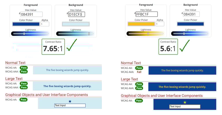
Color Accessibility
We tested our primary color combinations to ensure they meet WCAG accessibility standards. The results show strong contrast ratios, confirming that our text and UI elements are clear and readable for all users.

Usability Testing
Throughout the redesign process, we ran multiple usability tests to identify friction points and improve clarity.

Version 1
Version 2

Version 1

Version 2


Version 1
Version 2


A/B Testing
To improve clarity and engagement, we tested two variations of the testimonial layout. We selected Variation B based on user feedback and test results, integrating it into the final Dr. Pal homepage.


Testimonial Section
Mobile Navigation (Hamburger Menu)
To evaluate mobile usability, we tested two variations of the hamburger menu. We chose Variation B as the final design. Users felt more focused and confident interacting with a full-screen menu, especially when scanning multiple options.


Variation A
Variation B
Variation A
Variation B


What did I learn?
Stakeholder Collaboration: Regular meetings and feedback from stakeholders helped align the design with business goals and improve the overall experience.
What's next?
Conduct more usability tests to further improve the website’s performance and user experience.
User-Centered Design: Usability testing and user insights played a key role in refining the design and enhancing functionality.
Team Communication: Working closely with developers, graphic designers, and stakeholders improved our collaboration and boosted the site's efficiency.
Start designing and developing the mobile application to increase accessibility and reach.