DreamWed
Wedding Vendor Website Design


Dream Wed is a C2C platform focused on wedding vendors in the U.S. and has two types of users:
Vendors who can create accounts and list their services.
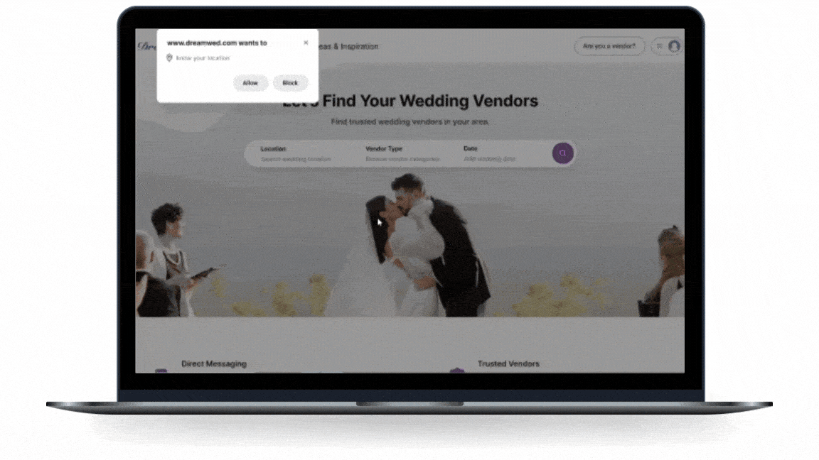
Couples who can easily find suitable vendors through search and filter options, and request more information or set up meetings.
Project Overview

Business Goals
Creating a platform that simplifies connections between couples and trusted vendors.
Business Needs
DreamWed platform supports a variety of vendors. Since each vendor has unique research processes, the business requested us to:
Design the website's information architecture

Supporting vendors and providing opportunities for employment and growth in wedding services.
Work on the task of selecting a venue
The Process
We used the Double Diamond method, taking an iterative approach that allowed us to move freely between stages as the project developed.


Discover
My team and I started researching to design the site's information architecture and identify user needs and mental models when selecting a wedding venue. This study was conducted in four phases:
Survey
Competitive Analysis
Interview
Secondary Research
Competitive Analyses


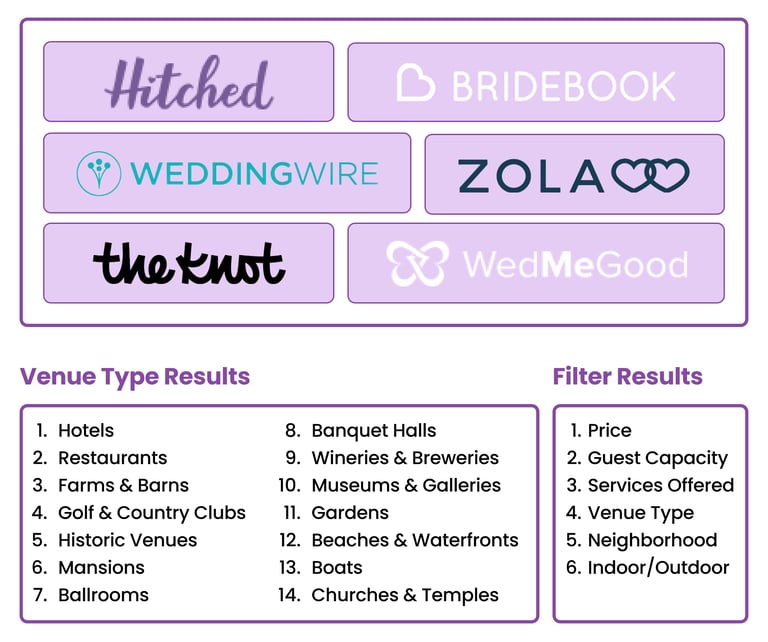
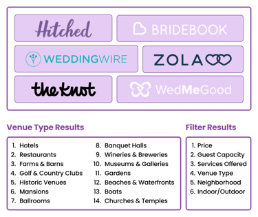
Venue Types: We analyzed common types and categories across multiple websites to determine the most relevant and user-friendly options.
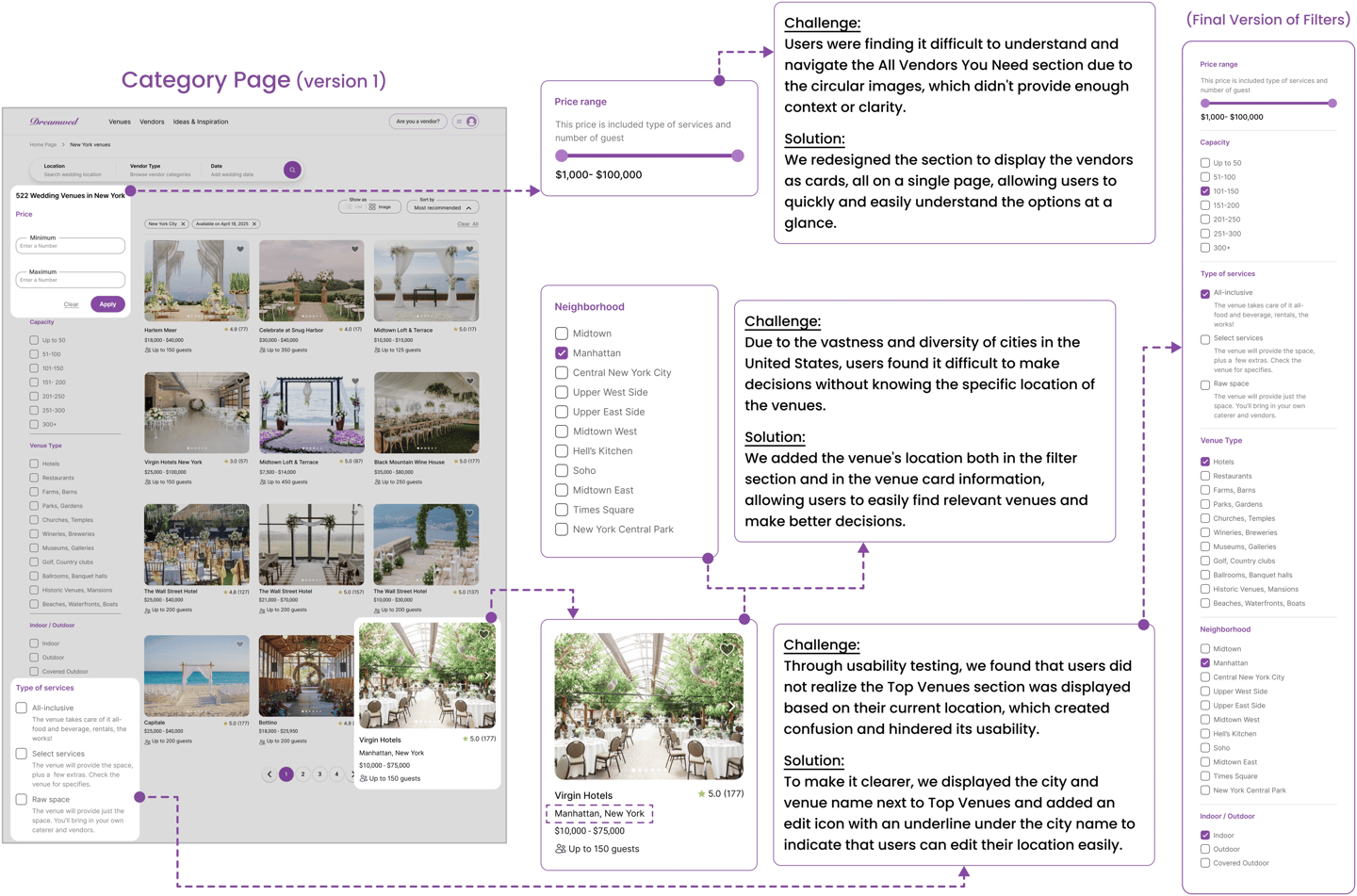
Filters: We derived initial filter categories from the Affinity Diagram and refined them through competitor analysis and usability testing. This process helped us identify and prioritize the key filters for wedding venue selection based on user preferences.
Next, we analyzed various websites to research two key topics:
Interview & Secondary Research
Then, to enhance our understanding of user needs and challenges, we used a combination of these methods:


Secondary Research: Since accessing a wide range of users was challenging, we analyzed user comments on venue pages from wedding websites. This approach allowed us to learn from real-world experiences and understand common pain points and needs.
Interview: We spoke with five users to gather firsthand insights into their experiences and preferences in venue selection.
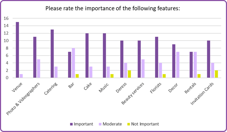
Survey
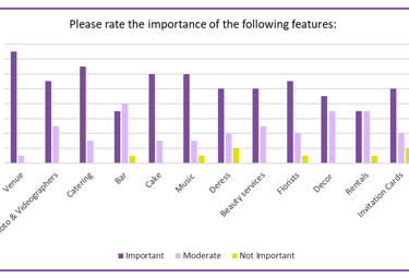
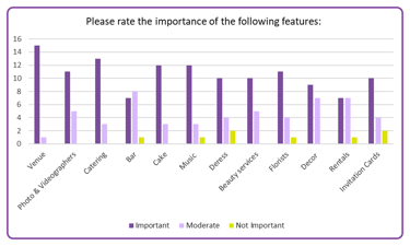
In the first step, we conducted a survey with 18 participants to gather quantitative insights that would help us design the information architecture and prioritize the categories of vendors.
Define
Affinity diagram
Affinity Diagram Based on the insights gathered from our research, we created an affinity diagram to organize the information into appropriate categories, identify key patterns, pain points, and highlight opportunities for improvement in the venue selection experience.

Indoor/Outdoor Options: Users prefer options that suit their style and season.
Take Away


High-Quality Photos: Users want real and high-quality images to visualize the venue.
Clear Communication: Fast and reliable responses are essential.
Reviews Matter: Ratings and feedback build trust.
Accessibility: Venues should be easy to reach and accommodate all guests.
Transparent Costs: A clear cost breakdown helps users make informed choices.
Capacity Information: Knowing the venue’s capacity is essential.
Type of Services: Details on services like catering are highly valued.
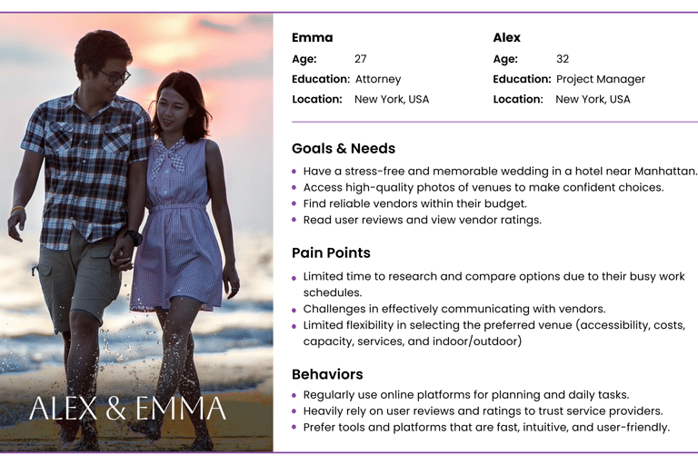
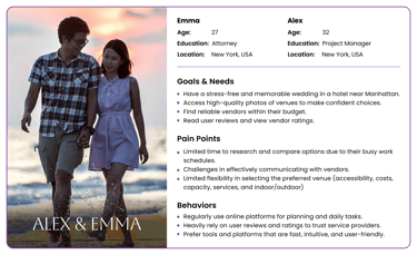
Persona
Now, we have created our persona based on the comprehensive research process and the data we gathered. This persona represents our target users, and the website will be designed based on Emma's and Alex's needs, preferences, and goals.


Site Map
Based on the results from competitive analysis and survey, the initial sitemap was designed. Following the design process and insights gained from usability testing, the final optimized version of the sitemap was completed.


User Flow
Considering the user needs and feature requirements specified in the project, we created a user flow diagram to define and visualize the screens and interactions users would experience while using the website.


Develop
Sketch
Through brainstorming sessions with the team, we created paper sketches to shape initial ideas and define the overall structure.
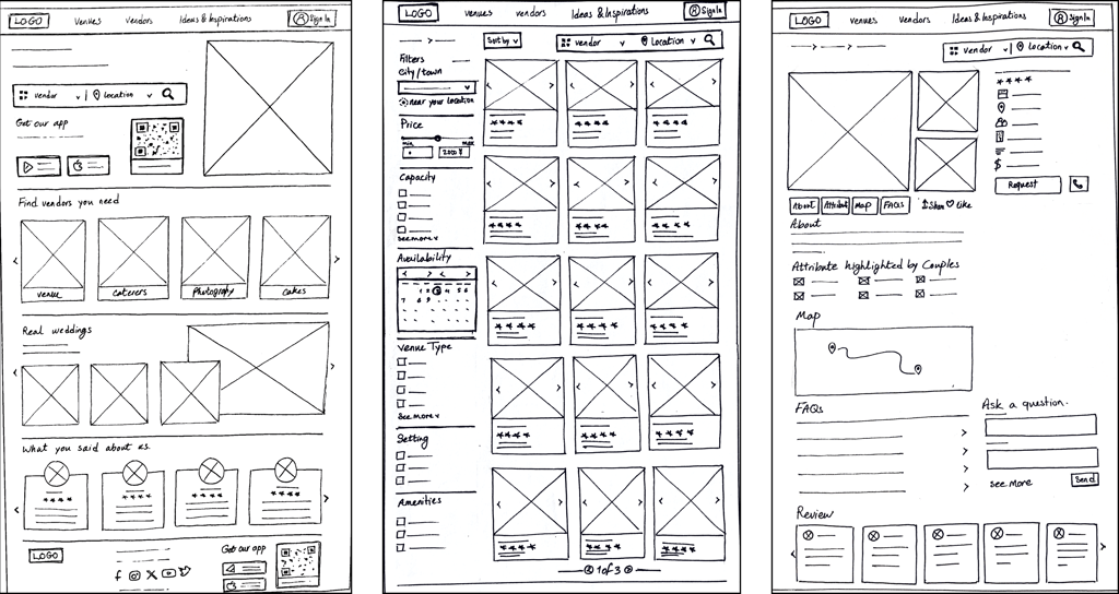
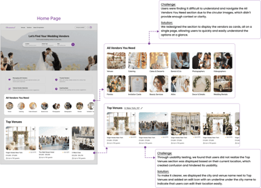
Home Page
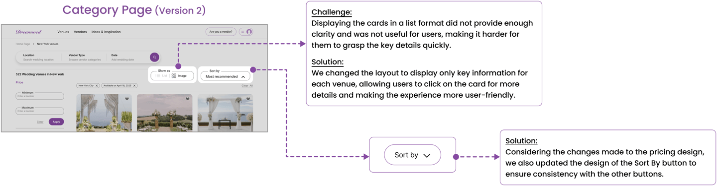
Category Page
Product Page
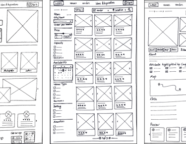
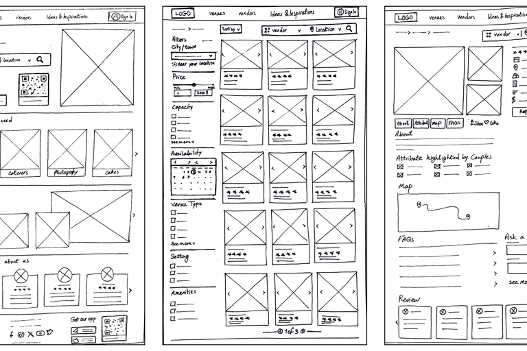
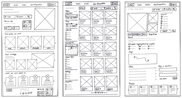
Usability & iteration - Phase(1)


Deliver
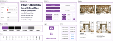
Design System
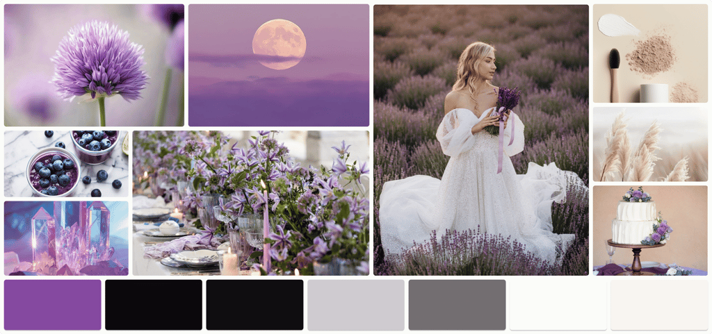
Inspired by the beauty of nature and its organic elements, this moodboard reflects a sense of softness, love, and trust. Every detail has been carefully selected to create a modern yet intimate atmosphere that showcases elegance and splendor at its best.


Usability & iteration - Phase(2)


Reflections
What's next?
We plan to conduct more usability tests and perform additional iterations to refine the design further.
What did I learn?
We aim to develop a mobile version of the platform to enhance accessibility and user experience.
Team collaboration sparked numerous brainstorming sessions, helping us gather diverse ideas and solutions.
User insights, along with usability testing and research, were essential in refining the design process for better results.
Multiple iterations were made to refine the wireframes, significantly improving the overall user experience.